ECHO (YouTube Video)

^ here’s the video I made for Anh Tran. I’m submitting this as my YouTube video for uni because I had a lot of fun making it, and it’s different and stylistic, which are qualities I want to show through my work in the future. One of the reasons I don’t see it as a client video is because I’ve been friends with Anh for years, which didn’t really make this project have an authentic client environment. Sure, we had meetings, but those meetings were held at the dog park while we took her dog out of a walk. I’d love to do more projects like this again, and can hopefully help Anh out more as she progresses through her studies. I directed, filmed & edited this one myself, which was a massive challenge for me. I’m glad I threw myself into the deep end & challenged myself, because I feel I pulled it off. I hope you like it (i do)!

– D.

The Magic of Colour Correcting

So I consider myself a very amateur colour corrector, and this fashion video has been a challenge of a video to colour correct. I had a major struggle in DaVinci resolve, as it wanted to effect the greyscale background as well as her skin, and every time I selected her skin, it would begin to look flakey. The biggest challenge was making sure the outfits were not being effected as well, which was a major struggle in DaVinci, no matter how hard I tried. I managed to tone down the orange tones in her skin a little bit, but afterwards I leaped into after effects and tried about 7-8 different colour grading tools, and finally got a better result. Here are some screen shots of what i’ve done:

colourcorrect1 colourcorrect2 colourcorrect3

It’s funny how you don’t realise how bad something is until you fix it. I knew her skin colour was off but…wow. For next time, I’m going to make sure the makeup artist doesn’t cover the model in an ‘on the spot spray tan’ when i’m not looking. I feel the tanning product mixed with a green screen reflection was not a good mix for her skin, but i’m glad I took the time to fix it for my client.  I’ve showed the client the finished product and she loves it, so if she’s happy, i’m happy! I’ll post the video soon, I’m just making some minor adjustments.

– D.

My Inspirations as a Filmmaker

[This blog post is a continuation from my National Cinema — German Expressionism post]

I’ve been making films for about two years now, so I should know what influences are shown through my work…right? Eeeeh, maybe not. Especially as of late, my work has been specifically client driven, and when I put my own spin on it, it’s either against the brief or is not to the clients liking.

Afflictions and Grumble Love are my two productions i’ve made where I felt I had more creative freedom. Even though Afflictions wasn’t as successful as i’d hoped, I still feel German Expressionism still slightly fed it’s way through, however not visually. My main character was severely corrupted, as she was seeing and hearing people who weren’t there and thought they were real people who were antagonising her. Corrupt characters are often found in expressionist films [as discussed in my previous post], and i’d never considered it to be an influence until I reflected back upon it. Grumble love is more difficult however, seeing it’s a documentary about pug rescue. Due to the nature of the doco, I can’t notice any influence poking through.

I’ve only been filmmaking for a short time, and this being said I haven’t had time to explore my inspirations and what style I most likely fit in (if any)… I know I am specifically fond of the expressionist films, but if that is the style I will pursue in the future, i’m not sure of. Instead of talking about the examples found in my work, I’m going to talk about the filmmakers that inspire me, and will hopefully help shape my future works.
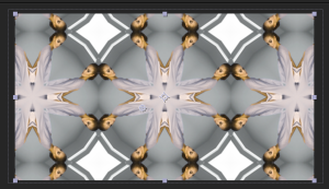
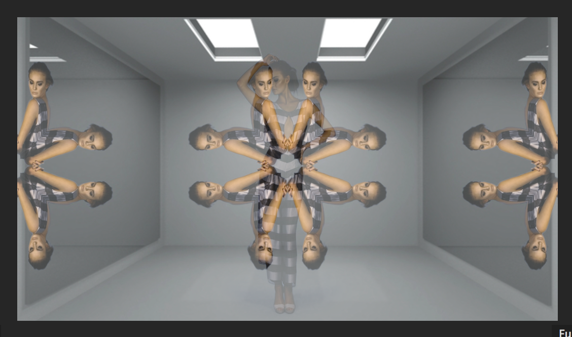
Lately, very recently in fact, I have been drawing inspiration from Wes Anderson and his use of symmetry in his films. I remember when I first began studying film, we learnt about framing and placing a person in a frame. We were always taught to place an object or person on a third of the frame, as if the centre of the frame isn’t “correct”. I’ve always been unsure about this rule as I never thought there should be a distinct way to film. It should be about expressing feelings and thoughts, not about distinct rules. It may be this rebellion for ‘rules’ as to why I love films that break them. This video of Wes Anderson’s centred frame gives me chills, because to me it looks so beautiful and elegant, and looks like everything I want to accomplish.

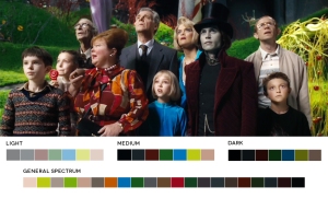
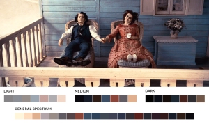
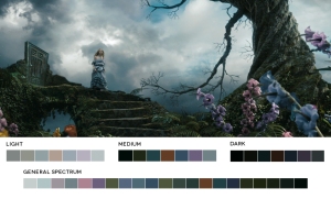
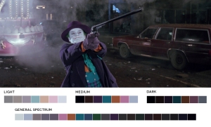
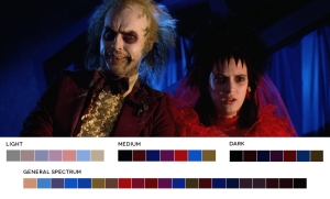
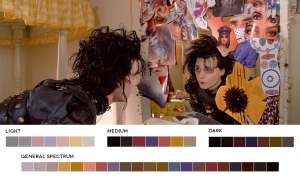
Along side Wes Anderson is Tim Burton (who I mentioned in my other blog post). This time, instead of talking about his expressionist qualities (which are my favourite), i’m going to talk about his use of vibrant colours amongst these dark ones. Some examples with colour swatches are shown below:

Charlie and the Chocolate Factory:

tim 2

Sweeney Todd:

tim 3

Alice in Wonderland:

tim 4

Batman:

tim 5

Beetlejuice:

tim 6

Edward Scissorhands:

tim 7

(all images from http://moviesincolor.com/tagged/tim-burton)

Burton is definitely one of my biggest inspirations in filmmaking and has continued to be for years. Not only with Burton having expressionist influences, but his ability to mix the bright with the dark. I haven’t had a chance to play around with contrasting colours as it takes a budget to dress a scene how you really want it, but I love how the darkness brings out the light colours. I remember watching Sweeney Todd for the first time and adoring Mrs. Lovett’s fantasy scene of her and Sweeney Todd falling in love, and the colours in the scene were almost dreamlike juxtaposed to the rest of the film. The use of colour helped tell the story and signified it was a dream like sequence instead of a real time sequence. This is also used in Beetlejuice and Alice in Wonderland. Burtons manipulation of mise en scene inspires me to be a better filmmaker, once I get the opportunity to do so.

These two filmmakers are definitely my top two that I regularly go back to.
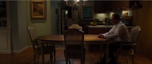
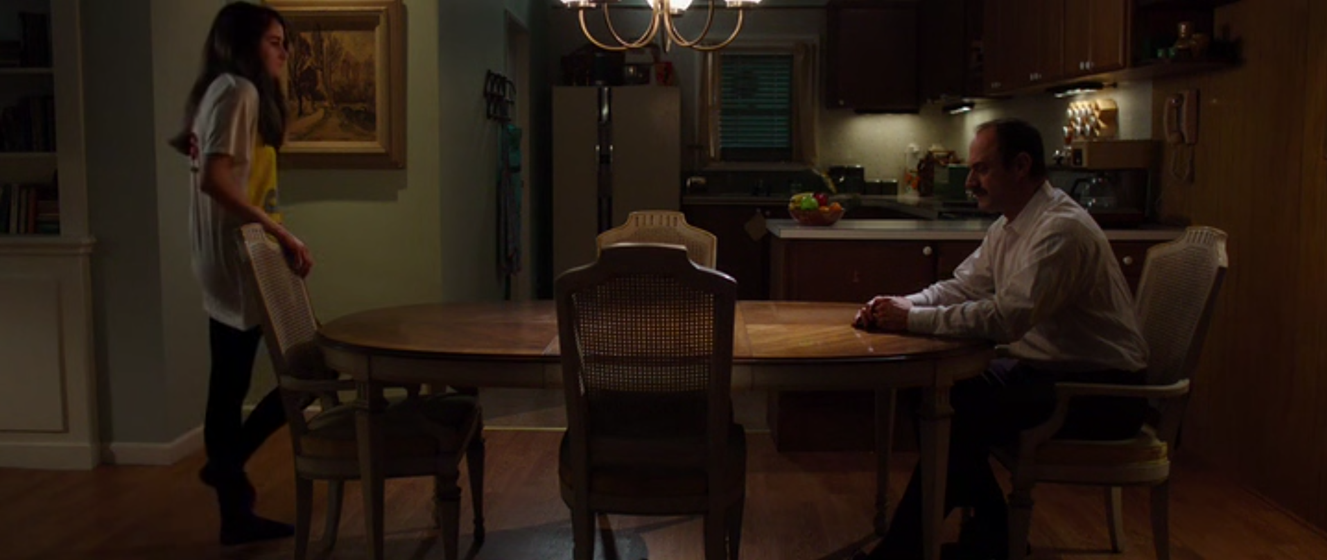
One of the directors who, when I get a break of study, want to look into is Gregg Araki, who directed White Bird in a Blizzard, my favourite film. The reason I keep going back to it is because it’s so authentic and real to its nature, and also breaks a few cinematic ‘rules’ we have learnt at uni (again my rebellion side is coming out). One of the main examples I can talk about, is his use of lingering shots to build both tension and to also make the audience feel awkward. The scene below is after the mother/wife in the film goes missing, and the father has fully realised the issue and is staring blankly into space, while the daughter is still indecisive and believes she will return again. The shot lasts for 73 seconds in total and displays minimal movement. Looking back at older Afflictions, I had a minute long frame which could have been influenced by this movie. It isn’t as symbolic as this scene, however it’s unchanging in the same sense.

Screen Shot 2015-08-07 at 2.22.19 pm Screen Shot 2015-08-07 at 2.22.34 pm Screen Shot 2015-08-07 at 2.23.33 pm Screen Shot 2015-08-07 at 2.27.13 pm

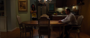
This one scene in particular is one of my favourites, as the lingering shot makes you feel what the characters are feeling. I want to be able to accomplish this in my films, and I hope to adapt this into my final project as well.

After looking into the filmmakers who inspire me, they all share qualities of breaking ‘rules’ that i’ve been taught so far at uni. From Anderson’s centred frames, Burtons distorted imagery and overly contrasted colours and Araki’s lingering shots, I can see myself latching onto these characteristics for my final project and future films to come. Once i’m out in the real world and making short films, I feel these influences will shine through my work. It’s hard to say for sure what my work will reflect, but these are what my inspirations are and what I love about film, because, well, they make me feel something. Thats what film is all about.

I look forward to the future to when I’m able to express different styles and know for sure, and I can’t wait to show it off to the world. Maybe i’ll even experiment over uni break and post it here! You never know.

Talk again soon,

– D

Kaleido-Madness

Screen Shot 2015-08-06 at 10.45.40 amHello again!

I’ve made a lot of progress with the fashion video! I’ve started moving from Adobe After Effects (AE) to working with Adobe Premiere Pro, and since I have both applications open, my computer has been going a bit slower, but is hanging on like a champ! I’ve been talking to my client more and showing her some more examples of what i’m doing along the way and she’s told me she loves them! Of course she had some minor feedback, but i’m just happy that she’s happy!

What i’ve begun to do now is import the AE exports and overlay the kaleidoscope effects (made with the CC Kaleida effect in AE) and make them flicker. To do this, I placed the Kaleida video above the regular video and added keyframes to drop the opacity so it flickered in a range from 100% to 57%. The final effect is working very well, i’m excited!

Below: Overlapping the Kaleida footage with the regular footageScreen Shot 2015-08-06 at 10.56.14 am

Below: Adding keyframes with lowered opacity to the kaleida footage:Screen Shot 2015-08-06 at 10.55.36 amBelow: finished results (screenshot)
Screen Shot 2015-08-05 at 11.26.42 pm
Screen Shot 2015-08-05 at 11.36.34 pm

I’ve also quickly exported about 10 seconds of a rough cut which I’m happy with,

I’m surprised at how nicely it fits with the slow, haunting music. I feel it’s better than if I were to put dubstep or upbeat music in the background. Overall, I’m happy with where this is headed, and I’m really glad i’ve pushed myself by diving into a post heavy project while being a production student. Directing, filming and editing a project is hard, no matter the scope of the project. From here on out, I just need to export another set of videos from AE and import them to Premiere, and i’ll be set!

More updates soon,

– D

[update: I shared the video with my client and she said she loves it – – yay!]

Fitness Promo!

[I mentioned this briefly in a previous blog, but I wanted to blog about it some more]

So last Sunday I helped Josh, Ryan and Jess film a fitness video for my sisters friend, Kody. He is beginning a 12 week challenge program (he is the personal trainer), and wanted to advertise the up and coming challenge through a video. I’ve been very busy lately, so the beauty about this project is I jumped on last minute. It was 10pm Saturday night when I jumped on, and we left at 5am to Ipswich. I conveniently finished work at 4am Sunday morning so I didn’t have to get up at a silly hour, just had to endure staying awake longer than my body wanted.

So, on the day, I was on camera #2 and filmed a bunch of B-Roll, which was all of the ladies working out in the ‘background’, but I did side on and closeup footage, while Josh filmed the interviews going on up the front. My main challenge was to not get the camera wet from the dewy grass, and had to make sure I was out of frame for the other camera.

It was a pretty straight forward gig and I tried to get as imaginative as I could with the shots, however it’s hard to focus on people when they are running! The sun rising and the shadows moving quickly was also an issue, but I think we dealt fine. Once the sun was fully out it was a lot better. Here’s the only photo I managed to get:

fit

Aside from camera, I was ordered to do random runs around the park to try and get rid of the birds, who didn’t want to shut up. The perks of outside shooting!

Anyway, seeing as I was only second DOP, I can’t say too much because I wasn’t in the production process at all.

Until next time,

– D

Product Shots Workshop + Promo Fitness Video

Last Friday we did a lighting workshop with Peter Baker and focused on lighting for a product shot. Lighting products is vastly different than lighting a basic dialogue scene, especially because you need to make an object look flattering and sellable.
We shot on the new Sony FS7 in 150 frames per second, and the image quality was amazing!
We started with a bottle of perfume, and Peter showed that even aluminium foil can create a dynamic background. Peter grabbed a C-Stand and taped the al-foil to the pole and hung it behind the perfume. The below image is the result of the al-foil, before any lighting set up:11219609_739553049499926_1656706866084210847_n

So even when house lighting was on, the image still looked great because of the setup. The next image is when we decided to head towards a warmer theme, and we put an orange throw over the C-Stand. In real life, the orange throw isn’t very pleasing and looks like it’s something purchased from a dollar store, however on camera it looks like a beautiful golden bokeh effect. We also used an orange gel to bring out the colours in the perfume. 11822281_739552986166599_3092470328875779843_n

After the perfume, we moved on to filming a RedBull can. I never thought about how perfect the presentation of the object needs to be. The smallest dent in the can becomes too obvious, and also you need to avoid spraying too little or too much water on the can being advertised. For this shot, I ended up helping Jonathan and was the focus puller. I feel I did a pretty adequate job, as we only really had one take to do it.  11781727_739552952833269_202662089813032606_n

This lighting workshop was actually pretty interesting, even though I really don’t like lighting. Despite that, it helped me learn more about paying attention to small details and how bouncing lighting around with diffusers is probably the best idea anybody has ever had. Hopefully the next thing I need to light is going to show improvement!

In other news, today I helped film an advertising video for a fitness company. The man who runs it is friends with my sister, and when she heard he was looking for a promotional video to be made, she threw him in mine and my brothers direction. Luckily, I didn’t have to plan anything for this shoot, and I literally showed up, filmed b-roll on the second camera, helped the others with a few things, and then was done! I’m not a fan of outside shoots as in previous experiences, the sun changing rapidly and loud background sounds can make or break a video.

11791954_739357416186156_3775388344786282513_o

I’m excited to see the edit to see if i’ve both improved and to see how it all folds together. Unfortunately only the PMW200’s were free, and i’m bummed I couldn’t get some action filmed on the new Sony FS7. My brother focused on the main interviews while I got all of the workouts they were doing in the background to cut too.

That’s all for now!

– D

Things Are Looking Up Milhouse!

From previous posts, you probably understand i’ve had trouble with a specific client video – the green screened fashion video. But alas, thanks to the aid from both Alex and Ryan, I/we have fixed it!

Screen Shot 2015-07-26 at 4.09.54 pm

This is where I am up to at the moment, i’ve put her in a pretty ordinary room, which the client likes. I’ve only fully done one outfit so far, but i’m doing things one at a time. I’m exploring different creative ideas, and have come up with so many new ideas… however, the client is not happy with any of them.

Screen Shot 2015-07-25 at 5.38.53 am Screen Shot 2015-07-25 at 5.39.00 am Screen Shot 2015-07-26 at 4.18.10 pm Screen Shot 2015-07-26 at 5.09.48 pm

My idea, shown above, was to create kaleidoscope patterns and put them on the mirrors in the room (the picture only shows one wall being covered), as the model herself cannot be reflected. I was really excited about the idea and put it forward to the client, however she didn’t like it at all. In her words, she wants it “to flash on the screen for a bit or something”…
*sigh*… I feel she’s locked in this little world of her idea and is refusing to budge. The room she’s placed in was a step forward from a white space at least.

So, at least the good news is, the keying looks 100x better, which was my main concern. My only challenge now is finding something thats engaging, which also matches what the client likes.

Thats all for this update, talk soon!

– D

What Makes A Great Director?

director

Last Friday Craig Proudley joined us again to talk to us about Directing and what makes us a competent, good and great director.

First he asked us what our favourite movie was, which my response was White Bird in a Blizzard (great film, watch it!), then he asked us, if there was an apocalypse and we had to save one movie for the entire race to show what cinema is, what would that movie be? The only movie that seemed to come to mind was Ghostbusters. It’s a great film though, let’s be fair.

Then we moved on to types of directors, the competent, good and great.
A competent director discovers no subtext behind a script. They are able to direct their actors on a basic level but can’t tap fully into their emotions because, well, no subtext. A competent director also makes vigorous camera decisions and always has the camera moving, however for no specific reason. Transformers and Man of Steel can be an example of movies with a competent director, where creating a spectacle, aka explosions everywhere, is more important than storyline.

A good director has knowledge of a subtext and adequate planning for their shot sizes and camera movements. They are able to direct actors in an efficient way that displays the subtext and emotion behind the story. Movies like this with a good director are Die Hard, which is considered a great movie due to it’s subtext.

A great director has an in depth idea of what the subtext of the film is and puts an extreme amount of thought into why a camera is placed where it is, why it moves and the meaning behind the movement. They follow ‘Bob’s Rule’ which (i don’t know the exact wording of this rule..) is to move the camera as much as possible, but only if it is motivated by story or character. They, in short, know the ins and outs of the film they are directing and understand the characters deeply. Craig’s examples of movies with great directors are Inception and the Godfather.

We also watched two different scenes from Heat, analysing why the characters moved the way they did according to subtext. The main character in the movie is played by Robert De Niro, and in the first scene he is at a busy restaurant. A lady recognises him from a book store he visited earlier that day and tries to start a conversation with him. As De Niro’s character is a gang leader and is always ready to be busted by the police, he gets defensive. One of the things we looked at in this scene was the way his body language conveyed subtext. Firstly he has his head down and looks withdrawn. We he begins to talk to the woman, he looks around the room with his eyes when he is speaking, looking out for police or anyone who looks suspicious. After he realises the woman is just making conversation and is not an undercover cop, he opens up. When this happens, the camera moves from shooting behind them to shooting in front of them. This movement breaks the 180 degree rule, however is justified due to the subtext and the way the director planned the shot. So evidently, not only can subtext help the storyline, but it can also help how the film looks overall, which is something i’ve never thought about before.

This class really excited me as an expiring director and I feel it’s going to help with my scriptwriting as well, which is conveniently what im doing for final project!

I look forward to more lectures from Craig, if we ever get the chance to have more.

Seeing how in depth people can analyse film and it’s subtext is amazing, and I think it’s going to help with my scriptwriting for my final project. So all in all, I really loved Craig’s lecture and I feel it’s helped me as an aspiring director

***SOS***

Well hello there!
I have officially gone into panic mode!

So much to do! So little time! I don’t know where the rest of the trimester has gone, but it’s flown under my nose!
So, trying not to fail, I have planned every moment of my life for the next week. Take a look:

kill me

Every bit that’s white on here is either travel time or sleeping time… or time for a meal. While preparing myself for the week ahead, I have realised I have a new spirit animal, and that spirit animal is Ron Weasley. Why you ask?
This is why.

ron 5 running

me running away from my problems

ron 7

me screaming because I don’t have time to eat

ron 4

me in a panic because I have so much to do

ron 3

me feeling a little sick from stress

ron 1

me crying

ron 2

me crying some more

ron 6

and finally, me looking at other people, crying out for help.

I feel like Ron and I share a lot on common. I have been making these faces for over a week now. I could also insert some more crying gifs but I wont, I don’t want to ruin my majestic Ron Weasley trend.

Today i’ve made some good progress I guess… and by good progress I mean editing things for a client video, then showing the client to see if she likes it, and her not liking anything I show her. So essentially, I have wasted a lot of time trying to achieve the look we agreed on, but not getting it right in her eyes. One day I will get there… one day…

Anyway,
i’ll blog again when i’ve got some positive news! (Which is hopefully soon)…
Back to work,

– D

LEARNING FROM MISTAKES

In one of my previous blogs i’d talked about a client shoot for my friends fashion video, and we decided to use green screen very spontaneously, without research and under a time constraint. These challenges aside, i’ve also never edited using green screen before, so we’re very lucky we had a chroma key class today, even if it was only for an hour.

I didn’t realise today just how hard it is to green screen if it isn’t lit perfectly. I’m in for a tough ride the next couple of weeks.
My main problem is the floor of the green screen. It was hard to get it all lit evenly at all angles, as well as the model, with a limited amount of lights. This was our first problem. Our second problem was the green screen being particularly narrow,  which gave us little room to work with amongst lights.

So for close up shots, it’s looking a little like this so far:

Screen Shot 2015-07-23 at 1.33.45 am

Screen Shot 2015-07-23 at 1.34.37 am

As you can see she seem’s a little choked around the edges and needs a good colour correction, but for now i’ve been working on the mask (all the little dots), with a big help from Ryan.
One of my biggest problems is, as mentioned before, the floor. At the moment, this is what it looks like:
(the image is a little blurry because it’s still rendering)

Screen Shot 2015-07-23 at 1.53.16 am

Now this isn’t as bad of an issue with a darker background but the client wants a white/grey background, so hopefully I can either fix the issue or change her mind.
Anyway, here’s a before/after pic of what i’ve done so far:

beforeafter

Her skin does look very orange, but I am going to fix it after I finish keying.

Hopefully I have another update for you soon,

-D.