For this LO we’ve been instructed to write a blog as if we’re giving a brief to a colourist with the example of Rinse & Spin.
Colour grading is an important part to any film production as it can make the final product go miles further. It can transform a flat, desaturated image to an image bursting with colour and depth. It can be used to improve the quality of an image, to create a style and to even create mood. In some cases it can also be used to deceive an audience that the footage was shot at a different time of day or even century.
First, there’s episode 1, ‘Pilot’
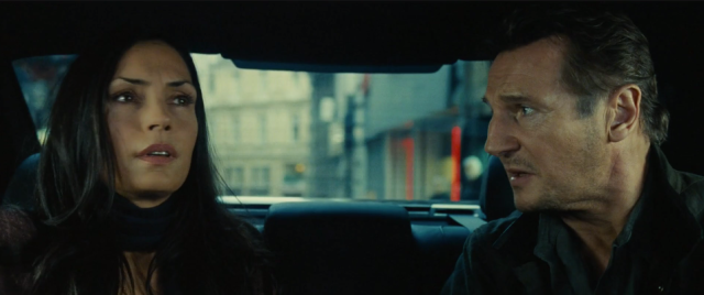
The first episode has no underlying theme to base a grade from like the following episodes. The pilot is the only episode that isn’t stylised, which impacts the grade. We still want to keep the plot a mystery to the audience, but a way to hint at it is through the colour choices. So for this episode, I want to aim it in the direction of hollywood action blockbuster. Hollywood action blockbusters usually have a cool dual tone look, where the highlights are warmer, but dulled, and the cool tones are brought out to be stronger. To do this, I would drop the saturation and bring out the cooler tones, like purple, blue and green. I would then desaturate the warm tones, which allows them to blend easier with the cooler tones to create a smooth, polished look. The examples below are from Taken 2 and Wolfman, and you can see in both images that there are cool tones throughout, with the warmer tones still intact. Using the screen grab from taken, their skin tone is very warm with orange undertones. The background of the image in the majority is cool, with flecks of warmth and pops of colour to keep the image interesting and colourful without looking too dull or flat. Using this colour grade style will create an action feel and will emulate hollywood’s action colour grade.
Episode 2 – Medieval
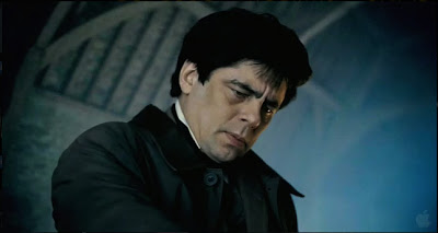
The medieval episode draws inspiration from the medieval era (obviously), which requires a lot of care to create a certain look. The colour grade for era pieces is what seals the deal, makes the end product look polished and complete. For this episode, I envision a sepia tone grade throughout. The use of sepia creates an older-time feel, as it reminds us of aged photographs that are slowly losing their colour. To achieve this look, I would get the colourist to use a selective colour tool to saturate the yellows and oranges in the picture, and then desaturate any aggressive tones, like bright reds, blue’s, purple’s… If necessary, sepia sometimes has a slight greenish tinge (note the second picture reference from Game Of Thrones) to create extra depth to the scene. As seen in the images below, they have an old time feel where we assume the image isn’t set in postmodern society.
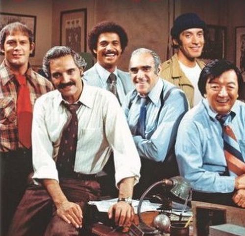
Episode 3 – 70s Cop
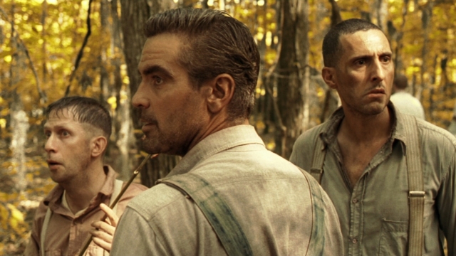
Episode three is another era piece, set in the 70s. As mentioned before, an era piece takes special care and attention in order to reach the desired look and goal. Seeing as the episode is set in the 70’s, it only makes sense to emulate the look of a 70s cop show. For the episode to look authentically like the style of the 70s, the colourist would need to be specific on the colours he wants to ‘pop’ on screen. I would suggest warm colours, like red’s and yellow’s, for the same reasons I mentioned for the sepia grade. Following the example of the photo below, taken from Barney Miller, we can see the image is grainy, desaturated and flat. The colours are somewhat vibrant but have no depth to them. I would want to emulate this look, by keeping the warm colours vibrant, while ever so slightly dulling the cool colours. I would suggest applying a warm filter over the top of the footage before dulling the cool colours, as the filter may already do that for you. Then I would drop the contrast slightly, being careful to not drop it too much and make the image look ‘milky’.
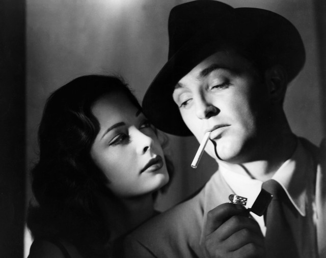
Episode 4 – Film Noir
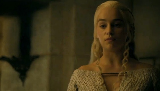
The fourth and final episode of the web series is inspired by the style of film noir. Film noir is very specific and difficult to pull off without practice and research. The style completely relies on the colour grade as it features high contrast images which are difficult to create without post production tweaks. To transform the original footage, which is flat and in colour, I would firstly transform the footage to greyscale. This will still leave the image looking flat and without any great shadows or highlights and may leave too much of the image in shadow or in highlight. To emulate the classical chiaroscuro lighting associated with film noir, I would then open curves and drop the shadows and raise the highlights to develop a high contrast look. If this doesn’t acquire the look completely, I would then move onto levels and adjust the contrast there, until it reaches the desired look of a crisp, high contrasted image. This will then create a look similar to the image below, with deep shadows and bright highlights, which act as a focus point for the viewer.
Colour grading is extremely important and can change how your film is perceived and felt. I am in no way a colour grader, however I do understand the difference it makes to the end product and why it is so important for it to be completed.
